
Every marketing calendar now comes with a familiar scramble: a product launch announcement hits, the social team needs a vertical Story, the content team wants a 16:9 hero, the CRM manager begs for an email header, and someone on YouTube is already asking for a thumbnail. Most tools that promise to resize image files bury the process behind logins, bloated feature sets, or remote servers. resizeimage.dev took a different stance. It is a browser-native image resizer focused on the “last mile” of visual production—getting a single asset into the right dimensions, aspect ratio, and format moments before you ship. This 2025 field guide breaks down how the app works, why its local-first approach matters, and how teams can fold it into repeatable workflows for social media, content marketing, product launches, and compliance-heavy environments.
Why Resizing Still Eats Time in 2025
The average campaign needs more image derivatives than ever. Social feeds reward fresh visuals, landing pages demand responsive hero shots, app stores insist on pixel-perfect screenshots, and internal decks never stop changing. The problem is not creativity; it is logistics. Each output has different aspect ratios, safe areas, and file size caps. Traditional desktop software handles it, but booting a heavyweight editor for a one-off crop image often costs more time than the resize itself. Cloud editors solve some friction, yet they trigger compliance reviews because assets leave the device. resizeimage.dev answers the question: “How can we resize image files fast, privately, and with enough control to trust the results?”
What Makes resizeimage.dev Distinct
At first glance, resizeimage.dev looks deceptively simple: upload, adjust, download. Underneath is a product philosophy streamlined for single-image work.
- Client-side processing: Everything runs in the browser. Images are never uploaded to servers, which keeps embargoed assets safe and eliminates queues.
- Two-column layout: The canvas lives on the left; all controls stack on the right. There are no hidden modals or onboarding tours to wade through.
- Modern presets: Instagram, X/Twitter, YouTube, Pinterest, LinkedIn, Facebook, Snapchat, and standard formats ship out-of-the-box.
- Unit-aware inputs: Designers can swap between pixels, inches, centimeters, millimeters, and points without mental math.
- Format flexibility: JPG, PNG, and WebP exports are available with precise file size readouts before you download.
By narrowing its scope, the tool feels closer to a surgical instrument than a multipurpose editor. That is exactly what teams need in the rush leading up to publishing.
Under the Hood: Browser-Only Architecture
resizeimage.dev reads files as browser Object URLs, processes everything locally, and releases resources the moment you reset or close the tab. No one needs an account; no logs or backups exist on third-party machines. For industries juggling NDAs, healthcare privacy, or embargoed launch materials, that architecture removes a common blocker. It also means the app feels immediate—loading a 5 MB product render is as fast as dragging it into the window. Without uploads or round trips, the “time to first preview” is measured in milliseconds.
The Interface Walkthrough
Once you drop an image into the tool, the workspace snaps into a clean two-column layout.
- Left panel: A responsive canvas with the image, orange drag handles, a rule-of-thirds grid, and a zoom slider (1× to 3×). A label above the frame shows the original resolution so you always know your baseline.
- Right panel: Stacked sections for Aspect Ratio, Size & Units, and Output Format. Each panel exposes its options immediately—there is no need to open drawers or step through wizards.
The simplicity is intentional. Marketing producers who only change dimensions once a week can still complete the task without onboarding, while designers migrating from Photoshop or Figma instantly recognize the cropping controls.
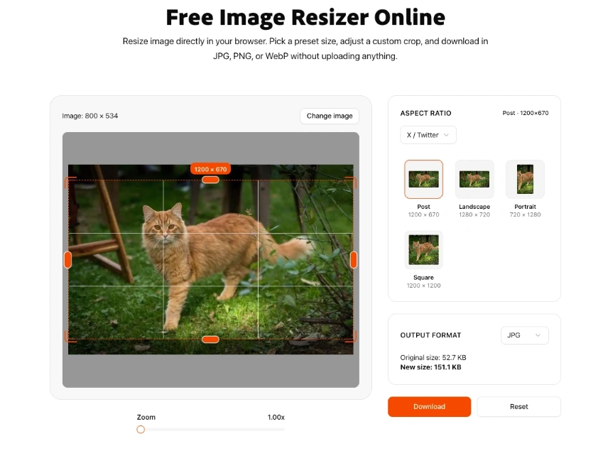
Aspect Ratio Presets for Real Channels
The first section on the right houses the preset library. Instead of burying presets in dropdowns, resizeimage.dev uses a card-based layout categorized by channel:
- Instagram: Story (1080×1920), Portrait (1080×1350), Square (1080×1080), Landscape (1080×566)
- YouTube: Thumbnail (1280×720), Landscape (1920×1080), Shorts (1080×1920)
- X / Twitter: Post (1200×670), Landscape (1280×720), Portrait (720×1280), Square (1200×1200)
- LinkedIn, Facebook, Pinterest, Snapchat, Standard ratios: Each includes 4–6 channel-specific ratios
Clicking any preset snaps the crop box into the correct aspect ratio and displays the target pixel count in an orange badge. Cycling through presets is instant, which is handy when stakeholders ask for comparisons (“Show me the YouTube crop next to the LinkedIn one.”). Because everything is local, you can hop between presets without waiting for processing.
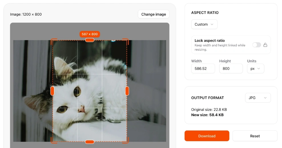
Custom Dimensions and Unit Conversion
When a stakeholder hands you an odd spec—say 1240×620 for a legacy CMS—switch to the Custom tab. Input fields accept width and height along with a units dropdown (px, pt, in, cm, mm). The Lock aspect ratio toggle keeps proportions consistent, while turning it off lets you stretch the crop for special layouts. Behind the scenes, resizeimage.dev converts everything back to whole pixels, so you never end up with strange halves that render poorly on the web. It is especially useful for print workflows where designers think in inches or millimeters but ultimately need pixel-perfect exports.
Cropping That Feels Precise
Cropping is where most image resizer apps fall short, yet it is the heart of the experience. resizeimage.dev handles it with lightweight but thoughtful touches:
- Eight drag handles for edges and corners, allowing constrained or freeform adjustments.
- Smart snapping that aligns the crop box to image edges, preventing accidental slivers.
- Rule-of-thirds grid to anchor compositions without leaving the browser.
- Zoom slider for surgical adjustments around UI elements, typography, or product edges.
- Keyboard-friendly interactions (drag, release, undo via Reset) so you can iterate quickly.
When you switch zoom levels, the crop stays centered, eliminating the dance of repositioning after every inspection.
Export Controls and File Size Transparency
The final panel focuses on output format. Choose between JPG, PNG, or WebP, and watch two numbers update live:
- Original size: The source file size in kilobytes or megabytes
- New size: A projection of the export size given your current crop and format
That preview helps teams stay under CMS and ad network limits. Need to keep email headers under 400 KB? Toggle to WebP or adjust the crop before downloading. The download button exports immediately—no queue, no watermark, no account prompt. A Reset button sits beside it in case you need a clean slate.
Scenario Playbook: One Image, Four Channels, Twenty Minutes
Most teams arrive in resizeimage.dev with exactly one asset and a looming deadline. Here is a repeatable flow for converting a single hero shot into four channel-ready variants in one sitting:
- Upload the master file. Note the original size badge so you remember how much room you have to play with.
- Hero banner: Choose Standard → Widescreen (1920×1080), drag the crop to keep the focal point above the fold, and export a JPG for the website.
- Email header: Switch to Custom and set 1200×600 with the aspect ratio locked. Nudge the crop to maintain breathing room for headline text.
- YouTube thumbnail: Jump to YouTube → Thumbnail (1280×720), zoom in to ensure text overlays remain legible, and export as JPG or PNG.
- Instagram square: Select Instagram → Square (1080×1080), center the subject, and export a WebP for social schedulers.
Each download lands instantly in your browser with clear filenames. Many teams append dimensions to the end (hero-1920x1080.jpg, hero-1080x1080.webp) to simplify handoffs.
Other Real-World Workflows
- Social media sprint: Community managers produce Story, Reel, Post, and X/Twitter variations minutes before scheduling. They rely on presets and the zoom slider to keep key subjects centered as formats change.
- Content + Product collaboration: A product marketer pulls blog hero images at 1600×900, LinkedIn banners at 1200×628, and dashboard screenshots at 4:3 from the same base asset. The unit conversion panel ensures DPI requirements are met for downloadable PDFs.
- Security-conscious teams: Hardware manufacturers under NDA can resize internal photos without uploading them to vendor servers, satisfying compliance while keeping designers productive.
- Training sessions: Design leads introduce interns to channel-specific dimensions using the interface as a live teaching aid. Trainees practice reading preset labels, manipulating the crop, and exporting with proper naming conventions.
Every scenario revolves around the idea that resizing should feel like a quick pit stop, not an all-hands fire drill.
How It Compares to Other Image Resizers
The web is full of tools with “image resizer” in the title, so what makes this one stand out?
- No account friction: Many competitors require registration or a download link sent via email. resizeimage.dev is open to anyone instantly.
- No server uploads: Privacy is a selling point, especially when agencies handle client embargoes or regulated data.
- Focused UI: There are no template marketplaces, stock libraries, or AI distractions—just the utilities you need to resize image assets cleanly.
- Clear sizing feedback: The original versus new size readout prevents guesswork, which is rare among lightweight tools.
- Consistent performance: Because processing happens locally, results are predictable regardless of network conditions.
That said, full editors like Canva or Adobe Express still shine when you need multi-layer layouts or batch automation. resizeimage.dev complements those suites by shaving off the last-minute resizing tasks that clog up your day.
Checklist for a Repeatable Resizing Routine
Teams that adopt resizeimage.dev often build a lightweight quality checklist. Feel free to adapt this for your playbook:
- Upload the source file and log its original dimensions and size.
- Confirm the target channel and pick the appropriate preset or custom dimensions.
- Use the grid to ensure the primary subject sits where designers expect.
- Toggle zoom to verify text, UI chrome, or product edges remain sharp.
- Lock or unlock the aspect ratio as needed to avoid distorted logos.
- Choose the export format and check the New size against platform limits.
- Rename the file with a consistent convention (
project-channel-dimensions.format). - Hand off with a note on format, dimensions, and file size for downstream teams.
Having a shared checklist eliminates the “Did you double-check the thumbnail?” type of back-and-forth that slows reviews.
Integrating with the Rest of the Stack
resizeimage.dev is intentionally narrow, but it lives within a broader ecosystem on resizeimage.dev’s site. The Tools Grid at the bottom of the page points to complementary utilities—bulk compression, format conversion, screenshot capture—that follow the same local-first principles. In practice, a marketing ops team might resize image variants here, pop over to a compression tool to meet performance budgets, and store outputs in a DAM or CMS with zero context switching.
Developers also appreciate how the tool aligns with existing pipelines. Many teams pair it with component libraries that expect specific breakpoints. By delivering assets in exact sizes, engineers spend less time writing overrides in CSS or generating responsive art direction with @media queries.
Collaboration Tips and Naming Conventions
Because there is no login system, collaboration happens through process rather than shared dashboards. A few habits make the handoff smooth:
- Standardize filenames: Include project, channel, and dimensions (e.g.,
launch-alpha-hero-1920x1080.jpg). - Track version notes: Use your project management tool (Linear, Asana, Notion) to note which preset was used and why.
- Store exports in shared drives: Even though the resize happens locally, teams can sync outputs to cloud folders or DAMs once approved.
- Document preset mappings: Maintain a quick reference that aligns business goals (“Email header below 400 KB”) with the right preset or custom entry.
With lightweight practices, a tool that lacks accounts can still serve a distributed team without confusion.
Looking Ahead: From Single Image to Tool Suite
The focus on single-image resizing does not mean the platform is static. The surrounding product roadmap hints at a larger ecosystem of browser-native helpers. Imagine resizing in one tab, optimizing file weight in another, and staging screenshots in a third—all without worrying about uploads or paywalls. That modular philosophy lets teams pick and choose the exact utilities they need.
Key Takeaways for 2025
- Speed matters. resizeimage.dev minimizes clicks between upload and export.
- Privacy is foundational. Client-side processing keeps sensitive imagery on your machine.
- Presets reduce guesswork. Social teams can stop digging through documentation for dimensions.
- Unit controls protect quality. Print and web specs coexist without manual conversions.
- Repeatability wins. Checklists and naming conventions help the entire team trust the pipeline.
If you often find yourself with a single hero image and a dozen output requests, this browser-first image resizer is a worthy staple in your production toolkit. Bookmark it, teach your teammates how to use it, and keep it open during the sprint to launch day. The next time someone Slacks you for “just one more crop image, promise,” you will have the workflow ready.
In a landscape crowded with AI-driven editors and bloated creative suites, resizeimage.dev proves that focus still wins: give people a precise way to resize image assets quickly, and they will keep coming back every time the release calendar accelerates.